1. How important is layout in small kitchen design?
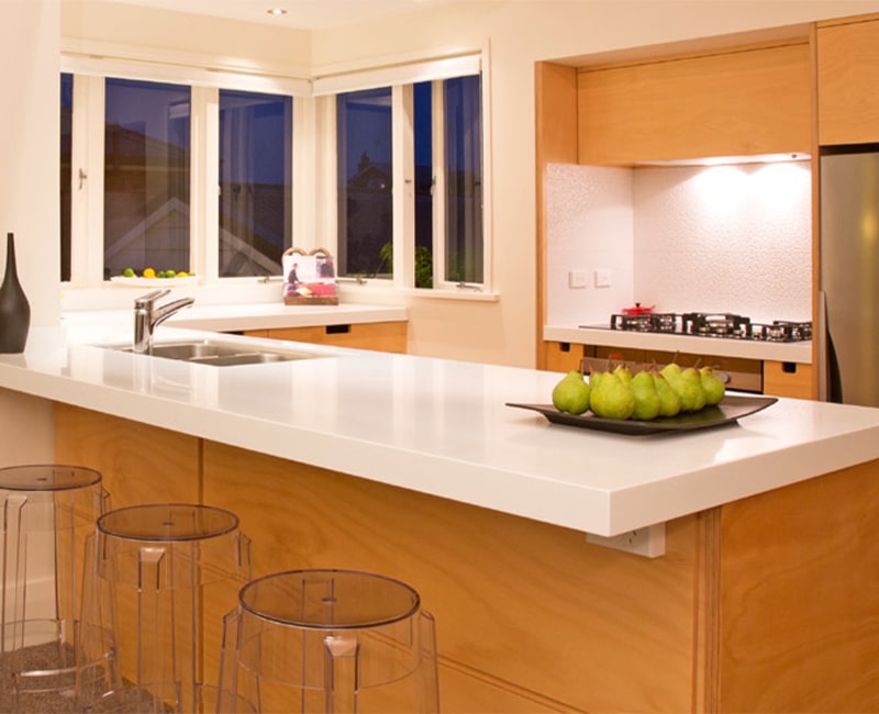
The layout of a small kitchen is extremely important when designing one. The elusive sweet spot’ is having appliances, storage drawers, and ergonomically correct workspaces all positioned for optimal functionality.
Understanding the dynamics of a kitchen’s workflow (what I call ‘Activity Zoning’) and prioritizing the design of the space itself as much as the objects within it is the key. Throwing a bunch of cupboards into a room can result in yet another cramped, awkward, and stressful kitchen nightmare!
It’s critical to minimize difficult corners, for example, from the start of the design process, as this can open up more space for drawers, easily outperforming even the best corner access systems. Just from a comfort and enjoyment standpoint, how the room is located in relation to the sun-angles is also worth considering.
2. What would you recommend for storage, and why?
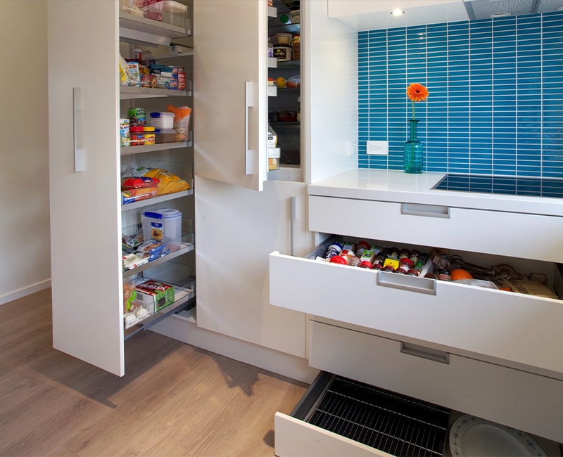
There are a plethora of clever accessories and gadgets on the market that can cleverly optimize available space. Once I have a thorough understanding of the homeowners’ specific needs, I advise on the true need for and configuration of these. It’s all about quickly and easily accessing and viewing the most-used items without bending down or struggling to see what the specific spice’s label says, whether in a small or large kitchen. Then, each drawer, cabinet, open shelf, and appliance has a predetermined purpose and is dimensioned to fit those specific types of items.
A bank of five spacious drawers under the cooktop, for example, uses the toe-kick space to gain an extra storage drawer for serving platters for this client in a compact townhouse.
While this specific assignment of function to specific drawers or shelves is desirable, it is also important to note that the ability to change this function over time as our food needs or cooking style changes is important. We accomplish this by designing adjustable divisions or relocatable inserts that allow for a wide range of configurations.

3. What are the best methods for maximizing bench space?
Again, most people would think of adding bench space to the design, but it is more about the right size of the bench and how it is designed in relation to the sink and hob. It’s all about the proportions and intended functionality of that specific bench zone, whether it’s for food prep, washing up, plating up, or baking.
I usually assess the overall space to ensure that there are at least two decent (650 wide x 650 deep minimum) bench zones for food preparation and plating up, as well as an additional Activity Zone for coffee making, and home planning, and/or evening drinks. Sinks are frequently outfitted with a fitted chopping board and colander combination to ensure that food preparation is mostly handled at the sink, leaving actual bench-tops free for other purposes. Brilliant!
4. What colors work well in small kitchen spaces?
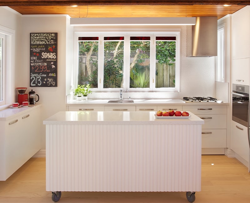
The dramatic panelled timber ceiling is its own feature here, but the island’s skin is detailed in a vertical shiplap texture that repeats the style of the home’s exterior cladding. The island can be rolled away on industrial-strength roller wheels to open up the living room for a large dinner party or big-game gathering. At its best, flexibility!
5. Are there any pointers for keeping the benchtops clean?
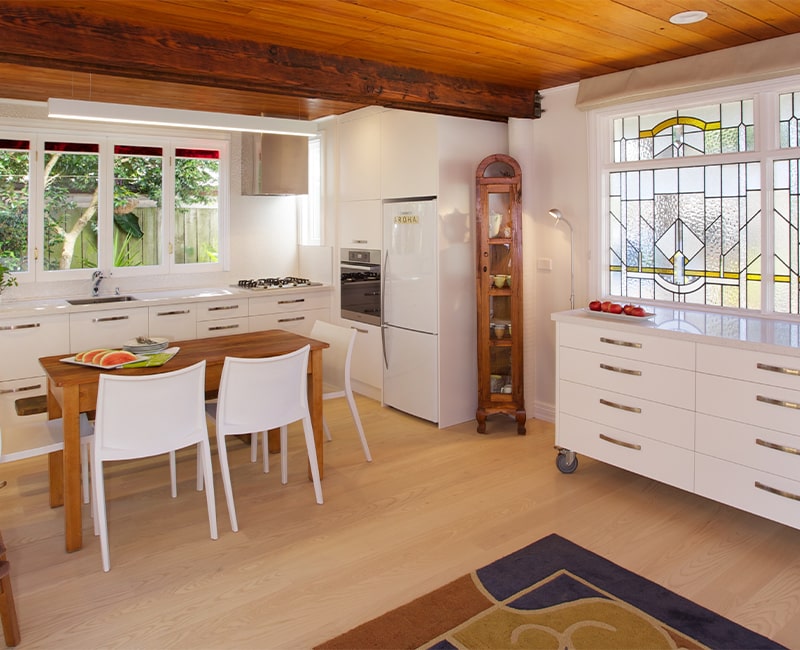
Absolutely! Getting clutter off the counters is important regardless of kitchen size, but especially when space is limited. This is usually solved by allocating drawer space for sharp knives, utensils (often with divisions in the top drawer), oils, small appliances, and dedicated home planning drawers or devices zone; all of which aid in decluttering the bench spaces. Everything has a place, and everything has a place – which makes for a stress-free cooking experience!
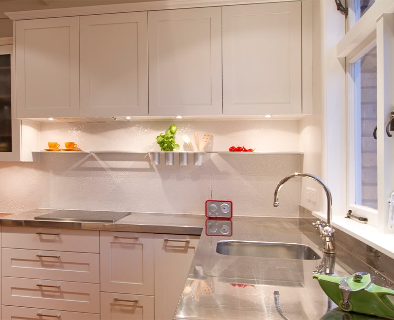
6. Should cabinets always be installed to the ceiling?
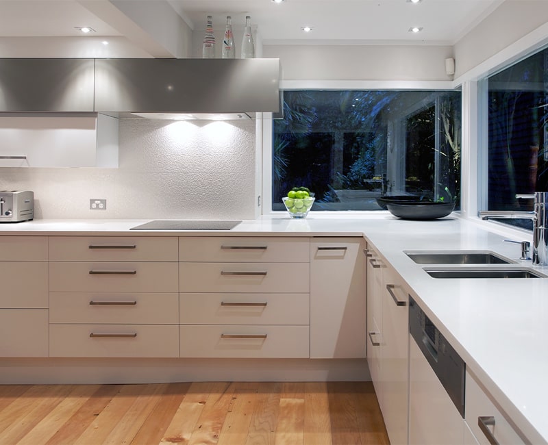
7. What other tricks do you use to make a small kitchen appear larger?
There are some form rules that use design elements to draw attention to the ‘good bits.’ You distract from the less desirable aspects by emphasizing the others, just as you would when wearing stripes or applying make-up shadowing. A contrasting deep-taupe stripe of cabinetry running perpendicular to the beam diverts the eye and elegantly unites the spaces as one in this kitchen, which had a low ceiling and beam dividing it. Friends who came to see us after the renovation thought the ceiling had been raised! I believe that the thoughtful use of natural and auxiliary lighting is a critical component of designing for the appearance of space and openness.
